
Wednesday, May 7, 2014


Tuesday, April 29, 2014
Project 12 Participation
In order to improve my storyboard, I should definitely display the basis of the game a bit more. The way its done right now only shows the character's abilities and not really what the game is actually about and this issue can detract from a viewer's understanding of the game. Another thing I could have done to fix it was to emphasize the main action of each scene. There are a few in which it is unclear exactly what is going on.


Tuesday, April 22, 2014


Project 11 Participation
Matt Fishman -
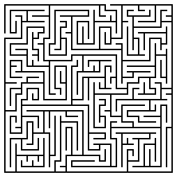
The texture looks a bit distorted, there seems to be
artifacts all over it (possibly because of the lighting). The illusion is
decent, the texture is done well so it helps sell the realism. The lighting
could definitely illuminate the maze a bit more as there are a lot of odd
looking dark spots. The bump map is okay but some areas look distorted. The
rendering angles could definitely be improved.
Project 11 Deliverable
My game
will be a 2D RPG platformer that uses stick figures as characters. Although the
main character is a human, there will be many different types of stick figures
throughout the game such as other humans, animals, companion pets, and monsters
all in a stick figure style. The character will be very versatile as it is an
RPG. For his strengths, he is able to use all different types of weaponry, he
is able to cast magic spells and he is able to use a grapple hook item to move
around rather freely. For his weaknesses, his default jump ability is minimal,
he moves rather slow and dies rather quickly. Later in the game he is able to
improve his jump ability and speed but enemies also improve in these areas so
they still remain as weaknesses.

Tuesday, April 15, 2014


Monday, April 14, 2014


Tuesday, April 8, 2014
Project 10 Participation
Matt Fishman - I would make the spotlight a little smaller so the highlighted area doesn't go above the wall. The texture is not too distorted and the bump-map does a pretty good job at showing the depth and the curvature of the stones.


Tuesday, April 1, 2014

Project 9 Participation
John Aromando - Your shape doesn't seem to be completely
isometric, there are definitely some perspective errors. Also make sure you
save your file in the right format to avoid blurriness.
Austin Demos - There is some distortion on the top right
side of your shape. Make sure you save as PNG or GIF in order to reduce
artifacts and improve quality.
Matt Fishman - There is quite a few alignment issues which
leads the perspective to look incorrect/off.
Evan LeClair - Use more contrast in your colors, it's very
hard to see what's going on in some areas.
Matthew Mensher - Your dithering is a bit too harsh and a
few angles are off.
Joseph Verducci - Increase the size of the image in
photoshop before posting and make sure you save as a PNG or GIF to avoid
artifacts and loss of quality.


Subscribe to:
Comments (Atom)